Best Email Popup Examples And Best Practices: How to set up successful website popups?
It’s no secret that email marketing is one of the most effective ways to reach and engage with your audience. But, like anything else in life, there are best practices to follow when sending out email campaigns, and one of them is the use of email popups.
With a little bit of planning and some careful execution, you can increase conversion rates and improve engagement with your subscribers through thoughtful placement of email popups.
Here are some best practices and examples for implementing an effective email popup:
Consider the purpose of your email popup
Before you start planning your popup strategy, you need to think about the ultimate goal of your campaign. Are you trying to encourage users to sign up or make a purchase? Are you looking to collect information or gather feedback from your audience?
Whatever your goal may be, you need to have a clearly defined purpose for the email popups before yous tart implementing them on your site.
Use a descriptive headline
The first thing a visitor will see when they land on your page is the headline of your email popup. In order for your popup to be successful, it needs to catch the attention of your visitors and encourage them to interact with it.
Design a compelling message that resonates
Your message needs to stand out from all of the other content on your homepage. The best way to do this is to incorporate a clear value proposition into your copy and design a layout that’s design to stand out and grab the attention of your visitors. Your message should compel your users to click on the call to action button and learn more about the offer that you’re promoting.
Use concise copy
Give users simple messaging instead of complex messages that complicate their thinking. It will be easier to convey the message with a brief headline, short description, and a clear call to action. The decision-making process will be greatly shortened as a result.
Try A/B testing
This is just a guideline based on what you've learned so far. There are some site elements for which makes even the slightest change can make a huge difference. In order to achieve high conversions with popups, it is crucial to test them. Testing different versions can help you determine the most effective type, timing, design, wording, call-to-action, visuals, etc. Creating variations, serving them up to visitors, and seeing which ones perform best is crucial.
Track popup performance
Track the performance of your popups and analyze the results. You can use the data you collect to determine the most successful popups and use that information to make improvements to future campaigns.
Email Popup Examples to Use on Your Website
Discount Offer Popups
Prospector Knives
What we like: The countdown is a simple and effective way to generate urgency. The countdown shows customers that they need to make a decision now, or else they'll miss out on the offer.
Hubspot
What we like: The popup is not as intrusive in covering the bursting colors and design that highlights the products.
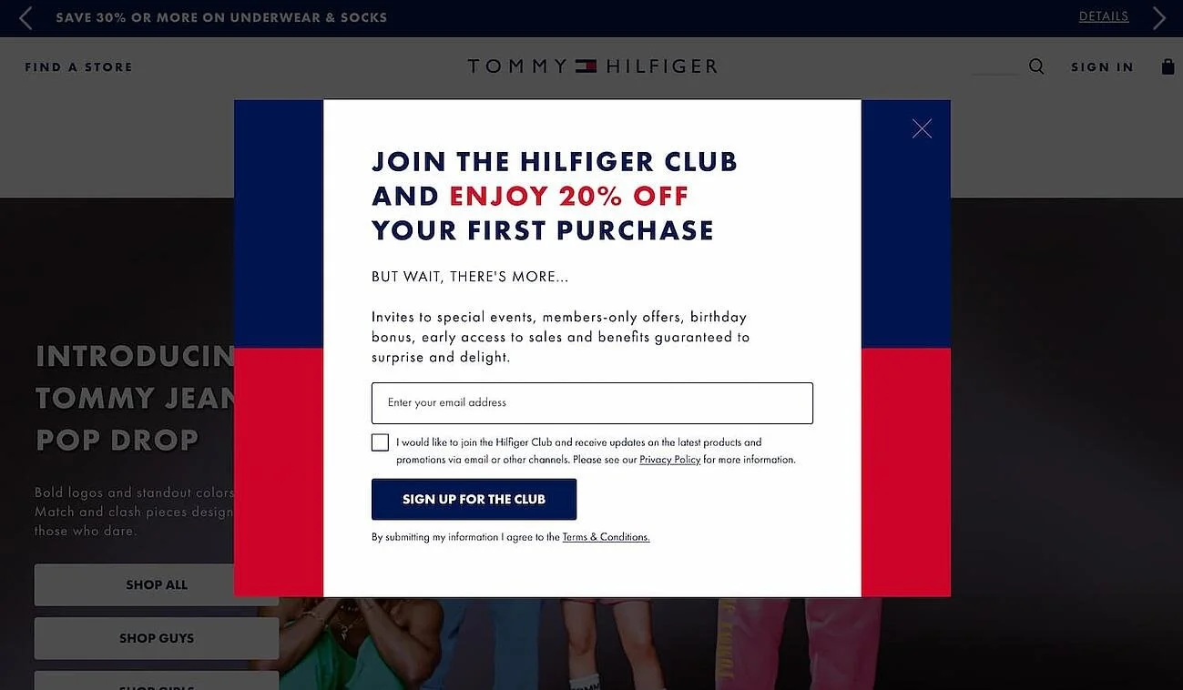
Tommy Hilfiger
What we like: Tommy Hilfiger's iconic red-blue logo forms the background for this modal. As well as clearly stating the benefits of joining the "club," the modal copy does a good job of explaining the benefits.
Oka
What we like: You will receive a discount based on the amount of your order. This is appealing to customers looking for free shipping. Customers from specific countries can also see the offer via geotargeting. As a result, the experience becomes more personalized
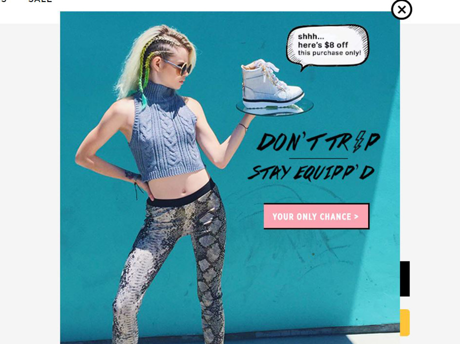
Zooji
What we like: Image naturally draws attention to the offer and captures the brand's tone through its unique design.
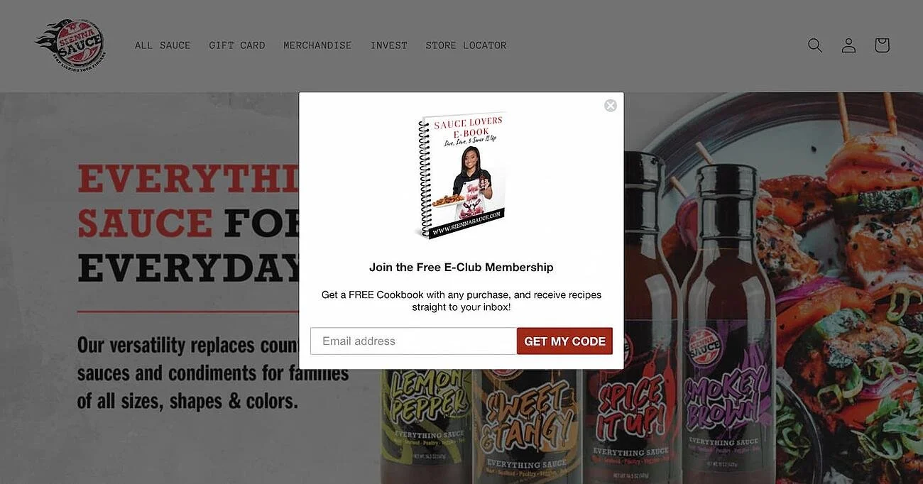
Sienna Sauce
What we like: This popup don't just solicit newsletter subscriptions, it also provide immediate content offers, such as cookbooks.
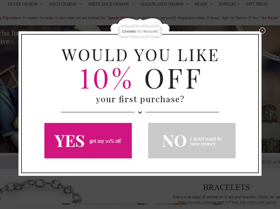
Charms To Treasure
What we like: Using a question in the title (preventing visitors from saying "no") gives a two-step popup an advantage over a one-step form that appears only to the most engaged users who have already clicked "YES." The offer and call to action are highlighted with excellent color choices.
Ollie
What we like: The popup highlights its unique offers and has a direct and compelling copy.
Iterable.com
What we like: Its position makes it less intrusive and does not interrupt the visitor's navigation while allowing them to browse and read blogs.
DigiDay
What we like: Yet another black and white popup. Despite its simplicity, the headline is catchy. In spite of this, the call-to-actions, especially "I'm not interested," cause visitors to rethink closing the popup.
Pure Pet Food
What we like: Playful and brilliantly designed. Increases the number of subscribers to your email list and encourages shoppers to make purchases at the same time.
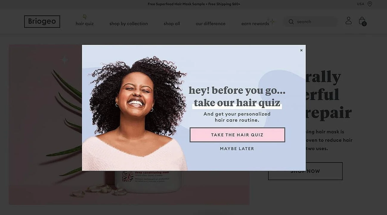
Briogeo
What we like: Featuring another compelling content offer, a free hair quiz and personalized hair care routine, this pop-up is more likely to capture some exiting traffic. Users can benefit from this offer because it's unique and provides a lot of value.
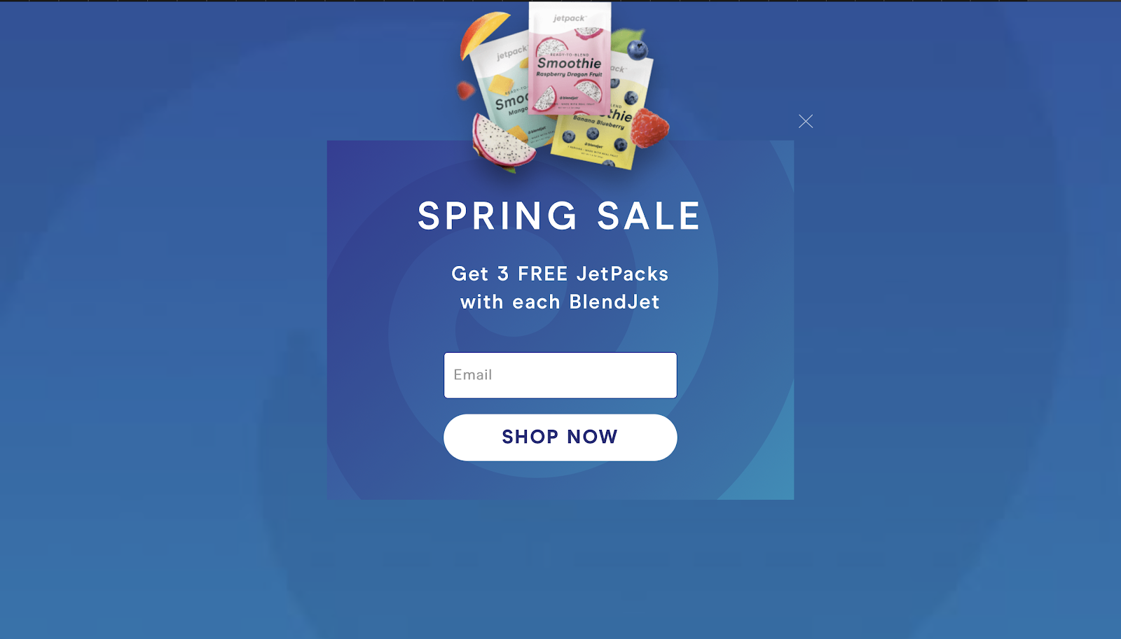
Blendjet
What we like: Pop-up uses a seamless background blend and has a straight-to-the-point message. Only an email address is required to sign up.
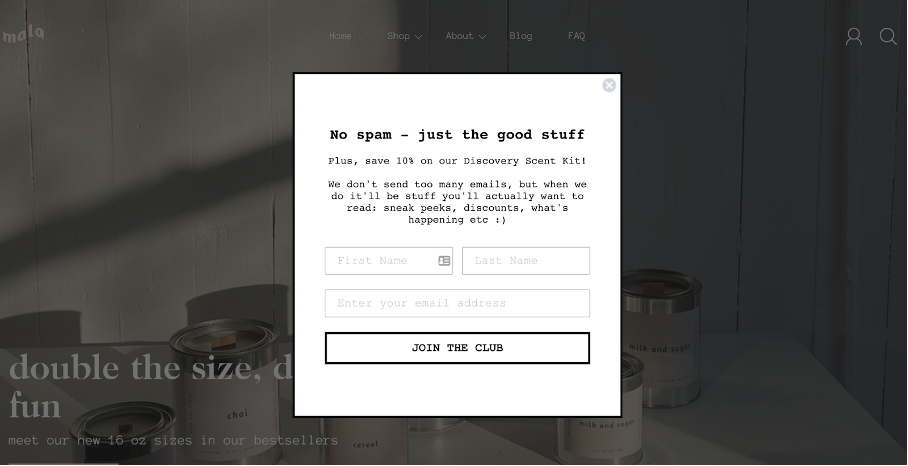
Mala the Brand
What we like: Assures subscribers that they won't be spammed. In addition to creating a sense of exclusivity, the popup uses a casual, first-person language.
Wrap up
Now that you know how to create your own popups, are you ready to start? We hope that we have given you some good ideas and inspired you to build something.

